Computer Practicum 1
This computer practicum contains the following five parts:
Learning objectives
After this computer practicum the student should be able to do the following in R Commander:
Retrieve and save data;
Calculate a new variable;
Calculate and interpret numerical summaries;
Make and interpret bar graphs, histograms, and (side-by-side) box plots;
Enter a new data set.
Part 1 - Downloading the data
The files, needed in the computer practicals of this course, can be downloaded from Brightspace at https://brightspace.wur.nl by choosing the course Basic Statistics:
- Select ‘Content’ in the top menu.
- Go to ‘Computer Practicals’ in the menu on the left of the Basic Statistics Brightspace site.
- In the right side of the screen there will be a blue header named ‘BS_Practicals_Data’ with specification ‘Zip Compressed File’. Click on this blue header named ‘BS_Practicals_Data’.
- The window will change, and display a button labeled Download for the ‘
BS_Practicals_Data.zip’ file. Click on the Download button, which will fetch the file and save it into the Downloads folder on your computer. - In your personal WUR OneDrive create a folder for the course ‘MAT\(14303\) Basic Statistics’. Within this folder create a sub folder for storing the data files for the practicals, e.g., named ‘data_practicals’.
- Go to the Downloads folder on your computer and open the downloaded ‘
BS_Practicals_Data.zip’ file. Select all files (e.g., using CTRL+A) and copy them (either using mouse right-click > Copy, or CTRL+C). - Go to the created folder for storing the data files of the computer practicals in your personal WUR OneDrive and paste the copied files (mouse right-click > Paste, or CTRL+V).
Unzip the files! All course data files needed for the computer practicals are downloaded as “Zip Compressed file”.
Part 2 - Analyzing smoking and pregnancy data
Researchers in the United States of America (USA) studied the effect of smoking by pregnant women upon their unborn child between 1960 and 1967. The data set contains data about mothers and their babies. The mothers gave birth in several hospitals in Northern California. The data used here is a subset of the total data set. The file named “BSP1_Smoking_Pregnancy.RData” contains the data for this computer practicum. The following variables are given for each mother:
- Length of pregnancy (“
gestation”) - Birth weight of the baby (“
weight”, in ounces not grams!) - Highest level of education of the mother (“
education”) - Mother smokes (yes/no) during pregnancy (“
smoke”)
The data set does not contain multiple pregnancies for the same woman. Women, who did not smoke during pregnancy, also never smoked before.
Open R (NOT RStudio). In the top menu bar go to: Packages > Load package\(\ldots\) Select the package named “Rcmdr” from the list of available packages and click the OK button to confirm your selection (a faster way is typing the command: library(Rcmdr) at the prompt “>” and executing it by pressing “Enter” on your keyboard). The window as displayed in Figure 1 should appear, which is named R Commander.

Go to: Data > Load data set\(\ldots\) and choose the file “BSP1_Smoking_Pregnancy.RData” with the data set to load. Go to: Data > Active data set > Select active data set\(\ldots\) and select “pregnancies_data” to set as active set. To quickly select or change the active data set click on the field next to Data set: just below the top menu bar.
- Click on View data set to get an impression about the data in the set. Indicate, on the answer form, for each of the variables if they are quantitative (discrete or continuous) or qualitative (ordinal or nominal).
- What are the statistical units?
- Is this research experimental or observational? Why?
- For the variable weight convert ounces into grams (\(1\) ounce \(\approx 28.35\) gram and keep in mind that R Commander uses a decimal point.). To achieve this conversion click Data > Manage variables in active data set > Compute new variable\(\ldots\) Replace the value “
variable” in the field New variable name with a new sensible variable name, e.g., “weight_grams”. The conversion from ounces to grams should be written in the field Expression to compute, by selecting variables (by double-clicking the required variable(s) from the field Current variables) and typing the needed expression for the conversion. Click the OK button to confirm and close the window for computing new variables. Use View data set to inspect, that a new variable is computed and added to the data set. - Give for both groups (non-smoke and smoke) for the variable “
weight_grams” the mean, the median, the standard deviation, the 1st, and 3rd quartile. The values are found by clicking Statistics > Summaries > Numerical summaries\(\ldots\) In the window, which opens, select the variable “weight_grams” (selecting multiple by pressing CTRL and clicking variable names). Click the button Summarize by groups\(\ldots\), select “smoke” as groups variable and click OK to confirm the selection. Next click the OK button to get the numerical summaries by variable “smoke”. Look at the Output part of the R Commander window for the results and fill in the table on the form.
By double-clicking on the numbers in the Output part of the R Commander window a number can be selected to copy and paste it into another program, for example a Word or Powerpoint document.
Visualizing data: bar chart, histogram and box plot
When a variable is qualitative or discrete, how many times each possible outcome occurs in the sample can simply be counted directly. A graphical representation can then be drawn, with the outcomes on the horizontal \(x\)-axis and the corresponding frequencies or relative frequencies on the vertical \(y\)-axis. Such a graph is called a bar chart.
For a continuous variable, such as “weight”, it is more difficult to draw a graph. After all, no two individuals in a sample will have exactly the same weight when weighed very accurately. For a sample of 150 individuals, it makes no sense to create a bar chart with 150 weights on the horizontal axis that all have the same relative frequency of \(\frac{1}{150} \approx 0.0067\) on the vertical axis. In this case, the outcomes of the “weight” variable are categorized into a limited number of ‘bins’, for example, \(< 55\), \(55-65\), \(65-75\),\(\ldots\), \(> 115\) kg. Relative frequencies for the bins are then calculated, and the visualization proceeds more or less in the same way as for a discrete variable. The graph obtained in this way is called a histogram. The bars in the bar chart are now rectangles, with no gap between adjacent bars, where the surface area of the bars (rectangles) is proportionate to the corresponding relative frequencies (and the total area is equal to \(1\) or \(100\%\)). When the bins are not of equal size, a wider bin corresponds to a wider bar (rectangle).
A continuous variable can also be visualized by means of a box plot. The box plot is based on the 5-number summary of John Wilder Tukey (minimum, first quartile, median, third quartile, and maximum).
In the next questions these three different visualizations of the data will be applied to the “pregnancies_data” data object in R Commander.
- Make a separate histogram of the birth weight of babies of mothers, who smoked during their pregnancy, and of mothers, who did not smoke during their pregnancy. Go to: Graphs > Histogram\(\ldots\), select the variable “
weight_grams”’. Click on Plot by groups\(\ldots\), and select as Groups variable: “smoke”. Press the OK button to confirm the groups variable selection and next click the OK button to create the histograms. You can find the graphs in a separate R Graphics window. To copy graphs into another program (e.g., Word/Powerpoint) right-click your mouse cursor on the R Graphics window and select “Copy as bitmap”. Use paste (CTRL+V) in the other program (e.g., Word/Powerpoint), where you want the graph to be placed.
If you go in the top menu of the R Graphics window to History and choose Recording, it is possible to go back- and forward between all graphs made during a R Commander session.
- Make side-by-side box plots for the birth weight in grams of babies for mothers who smoked during the pregnancy, and for those, who did not smoke during pregnancy. Go to: Graphs > Boxplot\(\ldots\) Make a sketch of the side-by-side box plots on your answer from.
If you have set History > Recording in the R Graphics window previously, then you can go back to the bar graph you made earlier by History > Previous (Page Up button on your keyboard) and go forward to the side-by-side box plots with History > Next (Page Down button on your keyboard).
- If the graph is correct, you will see single points and numbers outside the whiskers of the box plot. What do the points and numbers in the plot represent?
- Compare the first quartile of both groups calculated in question e) with the side-by-side box plots of question g).
- Make a bar chart for the variable “
education” for mothers, who smoked during the pregnancy, and for those who did not smoke during pregnancy. Use Graphs > Bar graph\(\ldots\). Change on the Options tab the Axis Scaling: “Percentages” by changing the radio button selection in front. Select as Variable: “education” and Plot by: “smoke”.
Don’t close R Commander, because in part 3 R Commander will also be used.
Part 3 - Car emissions
The transport sector is accounting for \(14\%\) of the total global greenhouse gas emissions, as reported by the Energy Protection Agency (EPA) in their August \(2016\) update of the ‘Global Greenhouse Gas Emissions Data’. The car industry is under pressure to step-up emissions reduction.
So far, thanks to aggressive emissions targets being set by regulators in the major markets, the industry has managed to achieve considerable cuts in car emissions. (https://www.automotive-iq.com/powertrain/articles/emissions-regulations-force-manufacturers-across-world-clean-their-act)
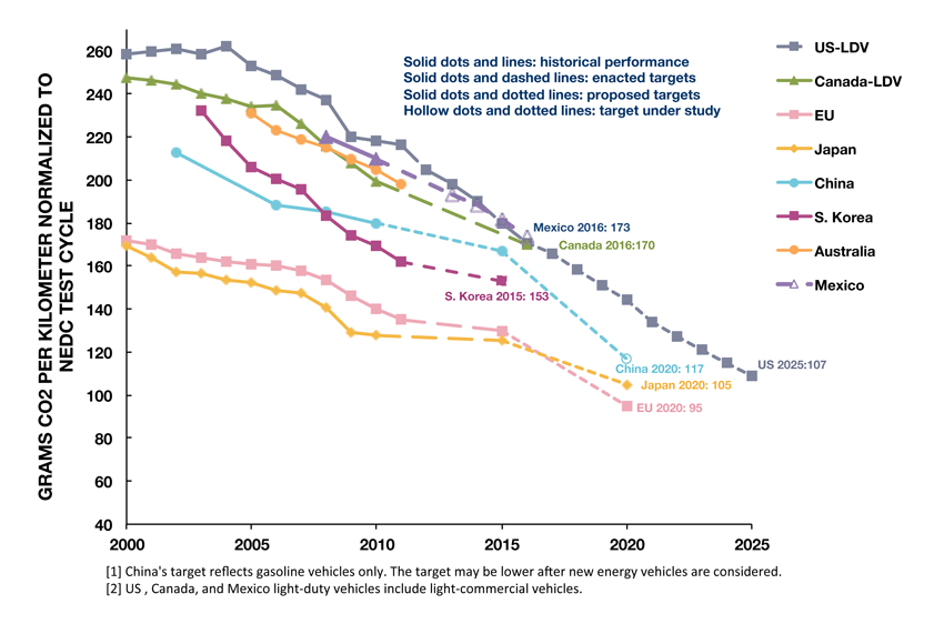
In Europe, cars are responsible for about \(12\%\) of total EU emissions of carbon dioxide (\(\mbox{CO}_2\)), the main greenhouse gas. EU legislation sets mandatory emission reduction targets for new cars. The average emissions level of a new car sold in \(2016\) was \(118.1\) grams of CO2 per kilometer, considerably below the target of \(130\) g. If the average \(\mbox{CO}_2\) emissions of a manufacturer’s fleet exceed its limit value in any year from \(2012\), the manufacturer has to pay an excess emissions premium for each car registered.
In the third part of this computer practicum the \(\mbox{CO}_2\) emission from different brands and types of cars will be investigated. These data are found at the website of the Environmental Protection Agency (EPA) of the United States. The data used here are part of a larger data set. In the file “BSP1_Car_Emissions.RData” the data for this part of the computer practicum are stored. The following variables are given for each car:
- Brand of car (variable: “
Brand_of_Car”) - Type of car (variable: “
Type_of_Car”) -
\(\mbox{CO}_2\) emission (grams per mile) (variable: “
CO2gmi”)
Go to: Data > Load data set\(\ldots\) to load the file named “BSP1_Car_Emissions.RData”. Change, when necessary, the active data set to “car_emissions”.
- Indicate for each of the variables whether they are quantitative (discrete or continuous) or qualitative (ordinal or nominal).
- The \(\mbox{CO}_2\) emissions in the data set are expressed in grams per mile. Compute a new variable (named: “
CO2gkm”), that expresses the \(\mbox{CO}_2\) emission in grams per kilometers (\(1\) mile \(\approx 1.609\) kilometer\(\rightarrow 1.609\) kilometer/mile). - Make a separate histogram of the \(\mbox{CO}_2\) emissions (g/km) per brand of car. What stands out?
- Make side-by-side box plots for the \(\mbox{CO}_2\) emissions (g/km) per brand of car. Give a possible reason why Toyota shows a very large spread in \(\mbox{CO}_2\) emissions.
- Repeat assignment d), but now per type of car. What stands out?
Part 4 - Reaction Time
In some sports reaction time – the ability to respond quickly to a stimulus – is very important. Squash, fencing, table tennis are examples of sports in which quick reaction times are very important. But also in traffic, the driver’s reaction time can be extremely important. In this part your reaction time will be measured and recorded. Online there are many tests available for testing your reaction time. The following website was chosen to measure your reaction time: https://www.justpark.com/creative/reaction-time-test/.
Go to: Data > Load data set\(\ldots\) and load the file named “BSP1_Reaction_Time.RData”. Change, when necessary, the active data set to “reaction_time”.
- Go to: Data > Manage variables in active data set > Convert numeric variables to factors\(\ldots\) Leave the settings as given and click on the OK button.
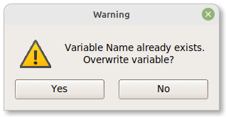
When you pressed the OK button, a warning message “Variable Name already exists. Overwrite variable?” is shown. Click the Yes button to continue.
After clicking the Yes button, the following window appears:
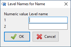
Fill in your name and the name of your computer practicum partner. When working alone use, for example, “Series A”, and “Series B”.
- Click the Edit data set button, located just below the top menu bar of the R Commander window. Do the online Reaction Time Test and enter the reaction time in the data set “
reaction_time”. Repeat this 10 times. When you work in pairs, each person is doing the online Reaction Time Test 10 times. When you work alone, please determine two series of 10 reaction times (you can, for example, see, whether the reaction times in the second series is faster than the first series). - Try to think about an adequate visualization,whether the reaction times of you and your partner (or the two series) are about the same or different.
- Calculate summary statistics of the reaction time for each person separately.
- Compare the mean and median of the reaction time for each person separately. Would you use the median or the mean? Why?
- Compare the Inter Quartile Range (IQR) and standard deviation of the reaction time for each person (or each series) separately. Would you use the IQR or the standard deviation? Why?
- Who, you or your partner (or which of the two series), has the lowest variability in reaction time?
Part 5 - UNICEF Education case study.
Go to: Data > Load data set\(\ldots\) and load the file “BSP1_UNICEF_Education.RData”. Change, when necessary, the active data set to “UNICEF_education”.
The data comes from the website: https://data.unicef.org, and tells something about the attendance of children at secondary schools. The data is from 60 different countries on four different continents. The variable “Total” represents the percentage of children attending secondary school within each country. The variables “Male”, “Female”, “Urban”, and “Rural” give percentages for the genders or sub-groups, indicated by the name of the variable, of secondary school attendance within each country.
To get a feeling about the data contained, click on the View data set button.
- Make an appropriate graph (histogram, box plot or bar chart) to visualize the number of countries from each continent.
- Make a side-by-side box plot for the variable “
Total” to see the difference in attendance of children at secondary schools between the four continents in the data set. - Compute a new variable (“
d_Female_Male”), which indicates the difference in attendance between females and males at secondary school (use for Expression to compute:Female – Male). - Make a side-by-side box plot of the new variable for the four continents.
- Suppose that UNICEF would like to invest in a country, in which girls are more likely not to be in secondary school than boys. Which country should they select, if they would like to reduce the largest gap observed? In other countries the attendance at secondary school by boys is less boys than for girls. Give the country with the largest gap in this way.
- Can you think of reasons, why there are such marked differences in secondary school attendance between boys and girls in different countries?
- Compute a new variable (“
d_Urban_Rural”), which indicates the differences in attendance at secondary school between urban and rural areas. Make a side-by-side box plot for the four continents for this variable. - When UNICEF has money to reduce the gap between education in urban and rural areas in the continent Americas, which country would be the obvious choice?