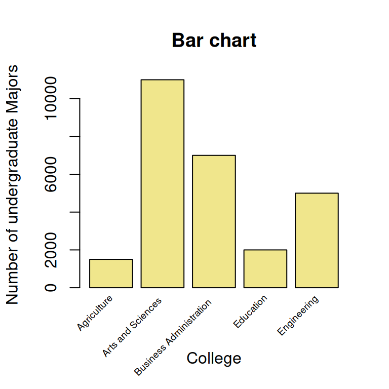
| college | noMajors | colAbbrev |
|---|---|---|
| Agriculture | 1500 | Agric. |
| Arts and Sciences | 11000 | ArtsandSc. |
| Business Administration | 7000 | BusAdm. |
| Education | 2000 | Educ. |
| Engineering | 5000 | Engin. |
Tutorial 1
Learning objectives
After this tutorial the student should be able to:
- identify: population, sample, unit, variables (quantitative: discrete, continuous; qualitative: nominal, ordinal);
- recognize and interpret a bar chart and a histogram;
- mention and draw (by hand) an appropriate plot for a given variable;
- interpret and construct a frequency table and a relative frequency table;
- interpret and calculate cumulative frequencies;
- choose the correct measure for central tendency for a given variable;
- determine and interpret the mode, median and mean.
Important concepts
Read for an introduction to the important concepts of population, sample, unit and variable:
-
paragraphs 1.1 and 1.2 pp.2-9, and
paragraph 4.6 pp.164-166, or
-
paragraphs 1.1, and 1.2 pp.2-8,
paragraph 4.6 pp.155-157.
Descriptive analysis for one variable: visualization
Read:
-
paragraphs 3.1 and 3.2 pp.60-66, and
paragraph 3.3 pp.66-75 (up to stem-and-leaf plot), or
-
paragraphs 3.1, and 3.2 pp.56-62, and
paragraph 3.3 pp.62-72 (first 9 lines).
Two different graphical representations for a single variable are discussed: the bar chart and the histogram.
There are small gaps between the bars. They indicate that the data is categorical or discrete. There are many variations of the bar chart.
Example 1.1: college majors
University officials periodically review the distribution of undergraduate majors within the colleges of the university to help determine a fair allocation of resources to departments within the colleges. At one review, the following data were obtained (see Table 1), which were presented in a bar chart as shown in Figure 1.
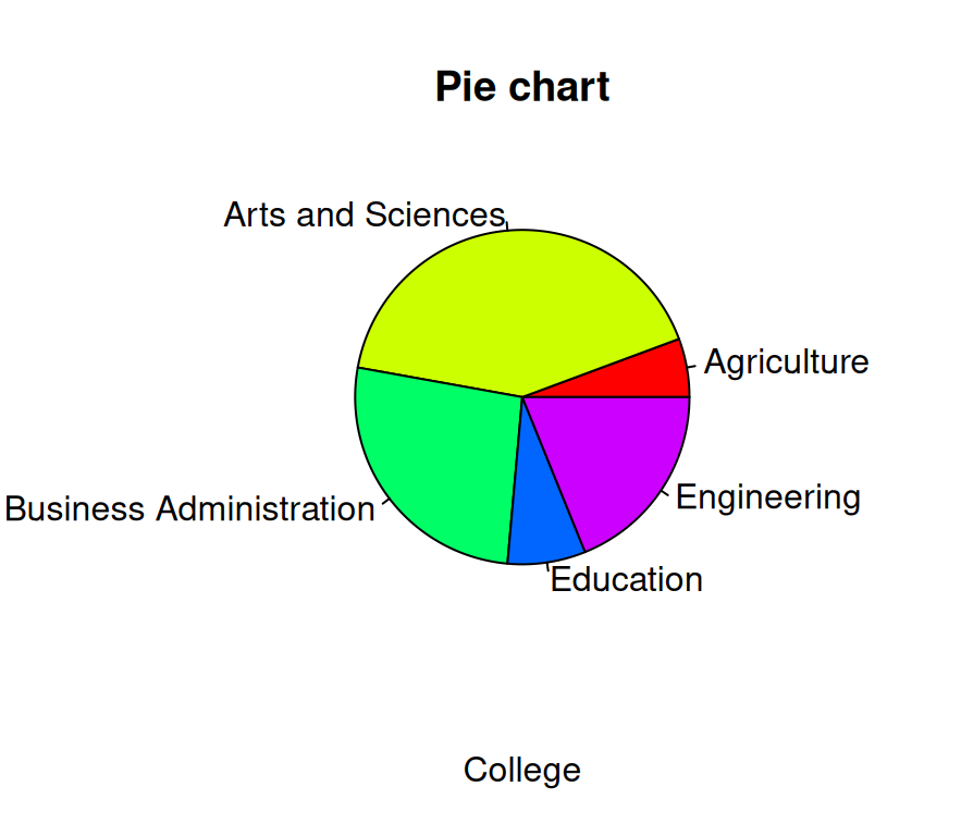
Note: In newspapers and non-scientific journals, data like these are often presented in a so-called pie chart (see Figure 2). However, in scientific papers bar charts are preferred, because they are often more clear.
ImportantRemarks about histograms.
A histogram also has rectangles but now these cover the full class interval without gaps in between; the rectangles are plotted along an interval scale.
A histogram shows the shape, center, and spread of the distribution. The choice of class width or the number of classes can heavily influence the shape/impression of the histogram.
Also for a discrete variable with many distinct outcomes, measured in classes (by approximation a continuous variable), a histogram may be suitable.
| 53 | 39 | 73 | 98 | 49 | 50 | 42 | 63 | 61 | 63 | 19 |
| 30 | 39 | 100 | 30 | 30 | 20 | 20 | 40 | 59 | 25 | 22 |
| 44 | 25 | 22 | 24 | 36 | 49 | 39 | 35 | 29 | 43 | 31 |
Example 1.2: Cultivation in greenhouses
A researcher did a small study about the cultivation under glass. He asked 33 growers the area of cultivation under glass. The results are shown in Table 2.
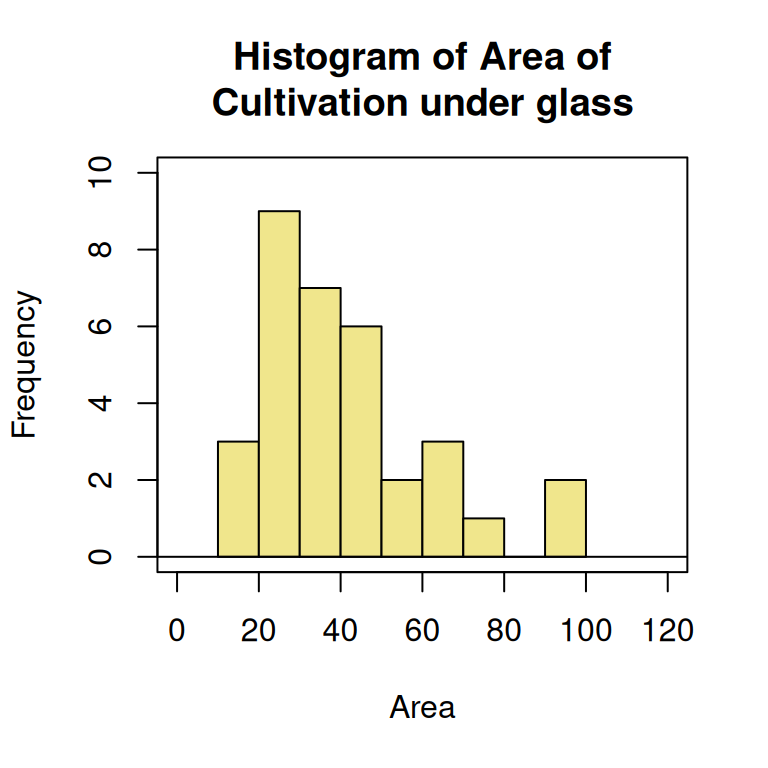
Most statistical software programs, like R, will make classes automatically, when creating a histogram (see Figure 3). R has chosen classes with a width of 10 units. In the histogram, you can see that the sample distribution is skewed to the right. The two largest observations could be called outliers (or extreme values).
Descriptive analysis for one variable: measures of central tendency
Read:
-
- paragraph 3.4 pp.82-90 (skip grouped data median and Example 3.4), or
-
- paragraphs 3.4 pp.78-85 (skip grouped data median and Example 3.4).
Measures of central tendency for a sample are discussed: the mode, the median, and the (arithmetic) mean.
Example 1.3: Number of plots
A researcher registers the number of plots (variable \(y\)) from \(55\) farmers, having companies of nearly the same size. The results are given in Table 3, and the corresponding bar chart is displayed in Figure 4.
| Number of plots | Frequency |
|---|---|
| 1 | 3 |
| 2 | 5 |
| 3 | 5 |
| 4 | 7 |
| 5 | 9 |
| 6 | 7 |
| 7 | 8 |
| 8 | 4 |
| 9 | 3 |
| 10 | 2 |
| 11 | 0 |
| 12 | 2 |

The mode equals \(5\).
The median is the \(28^{\mbox{th}}\) observation. Therefore, the median is equal to \(5\).
The mean is \(\bar{y} = (3 \times 1 + 5 \times 2 + \ldots + 2 \times 12)\ /\ 55 \approx 5.491\).
R and R Commander can both provide a convenient summary of the data, using the shown commands.
Exercises to be done during the tutorial
Exercise 1.1 up to and including Exercise 1.5 are in the presentation handouts of Tutorial 1. For answers/feedback check Brightspace.
Exercises to be done after the tutorial
For answers/feedback check Brightspace.
Exercise 1.6
Do either
Exercise 1.7
Do either